Storytelling with maps and graphs – Some examples

It’s like an app, a separate presentation not embedded into the navigation of the mother website. One single link only – behind the NSI logo – gives the context to the whole statistical content offered by Statistics Italia. I speak of … noi italia.

And it’s beautiful. A mix of static and dynamic (flash, delivered by NCVA) content, text (some call it storytelling) with interactive graphs and maps. .

With the same technology used by noi italia Statistics Sweden just launched its Statistikatlas and also some thematical visualisations or vislets integrated into the website.

Compare i.e. with EUROSTATS Table Graph Maps application which has no texts or storytelling included.

Or with Switzerland’s Stat@las.

NComVA: Enable anyone to easily create and share interactive statistics news through our recognized Publishing tools

Statistics eXplorer help you discover patterns and insight to provide the basis for better understanding and decisions with the same tools and methodologies that today are used by our customers OECD, Eurostat, World Bank and many national and regional statistics bureaus. Passing on knowledge from your analysis and storytelling through our Publisher Statistics to your website or blog using a Flash based dynamic visualization. Statistics Explorer represents a unique and elegant layout where the visualization is in focus and user interfaces reside invisible in the background. An effective combination of time-linked views can simultaneously analyze and visualize data and help you make the right decision when you need to know more about national or regional statistics.
Customizable (Open) Statistics eXplorer is the generic version of Statistics eXplorer for customizing statistics visualization applications for any regions and their related indicators. Our standard products World eXplorer (nations), Europe eXplorer (NUTS2 and NUTS3) and Sweden eXplorer (counties and municipalities) integrate data from official databases (World Bank, Eurostat, Statistics Sweden, SKL, etc.) with your own indicators and let you, for example, compare your regions of interest with others.


Better decision support at iPad

Translated from Computer Sweden by Google translate:

Of Joel Åsblom

The Swedish decision support provider QlikTech has developed a version of QlikView iPad. Among the users are a Dutch customer who has supplied 150 offices with Apple’s tablet PC.

Qlikview i olika manicker.
Qlikview of various widgets.

QlikTech has recently invested heavily in developing mobile versions of the decision support tool QlikView. 

– We tailor Qlikview for iPad, iPhone and Android. One can of course also run regular QlikView AJAX client in the browser on them, “says marketing manager Jennifer Ehle QlikTech.

She says that many Swedish customers running pilots of mobile clients, mainly on the iPhone, and that interest is also great from the outside world. The latest example is the Dutch mortgage lender, the Hypotheekshop as equipped sellers of 150 offices with Apple iPad. With them will Qlikview enhance sales and improve customer service.

Among the advantages of QlikView brings out is that Ipadversionen of Qlikview has features to analyze business data directly with customers. Since the iPad has built-in GPS, you can, for example to obtain local information about the inventory data to customers within a specific geographic area.

Qlikview HD will initially be designed for the multi-touch interface that is available in Apple’s tablet PC where you can both tap, pinch and drag to select data points.

Gapminder Teacher’s guide: 200 years that changed the world

From: http://www.gapminder.org/downloads/200-years/

Quick Links
Download PDF
Download Word
Levels
Secondary school
Subjects
History, geography & social studies.

About the Lesson/Teacher’s guide

This teacher guide explains how you can use Gapminder World to lecture about global development from 1800 until today. For inspiration, you can watch a brief video-lecture with Hans Rosling here.

Key messages of the lecture

  • In 1800, income per person was low and life expectancy was very short in all countries.
  • Health is better everywhere today, even in the poorest countries.
  • Income is much higher in most, but not all, countries today.
  • The income and health gaps between countries are larger today.
  • Most people today live in “middle income” countries

Posted in  | Tagged 

Gapminder Desktop launched

Now you can use Gapminder World – with all its indicators – from your own computer, even when you have no Internet. Just download and install the new Gapminder Desktop (from Gapminder News).

A downloadable version of Gapminder World is the single most requested tool, and we are very happy to be able to now offer just that, free of charge.

Click here to downloadClick here to download Gapminder Desktop

Gapminder Desktop is particularly useful for presentations as it allows you to prepare your graphs in advance and you won’t need an Internet connection at your lecture or presentation.

In the “list of graphs” you will get at preset list of graphs on the left side, but you can also very easily create your own favorite examples. Simply arrange the graph the way you want it and click “bookmark this graph”. Your example will the appear in your own list of favorite graphs. Perfect when you want to prepare a lecture or presentation.

Click here to download Gapminder Desktop

Statistics Sweden social media contribution to Eurostat “Sponsorship on Communication”

http://swedeneurostat.blogspot.com/

The blog  is an example on how to extract and visualise Eurostat statistics. It is a Statistics Sweden prototype within the Eurostat project called “Sponsorship on Communication”. The project is initiated by the Spanish NSI during their present EU chairmanship. All member countries have been invited to contribute.

The idea from Statistics Sweden is to focus on Sweden in the European statistical context in a blog based on publishing from Eurostat, e.g. Statistics in Focus and other European data . Information and data connects to social media functionality. It can be RSS flows based on regular Eurostat and Statistics Sweden publishing and on blog and Twitter searches. Any other country within EU can apply the approach to their own country from this framework.

The search functions are from Google. The information flow in the blog list is constructed from Google Blogger widgets. New ones can be added and obsolete ones can  easily be replaced. They automatically update the flow of  information once they are defined.

In the module “Latest Search Results about Eurostat and Sweden”  pre-defined search terms are presenting results directed to different  media like images, videos, news, blogs, updates, books and discussions. They can also be categorised in time, geography and related to different search terms.

By enter key words at  “Search this blog” extended alternatives are presented to widen the scope of search to sites linked from the blog, the blog list, Statistics Sweden and Eurostat publishing and finally the whole web. So universal search is combined with more narrowly defined search destinations depending on how the blog is organised.

There is also news roll displaying information from different news media continuously through a widget. Also this information is updated automatically and search words can be changed or extended.

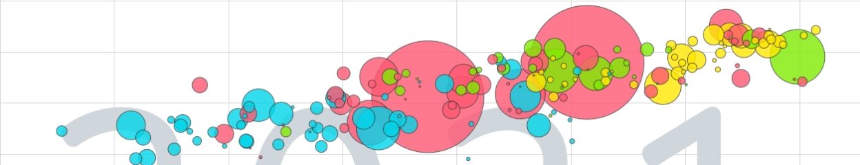
The scope and functionality will be tested and developed. It has been presented to journalists and media so far. We have recently included also an example of interactive publishing including statistical story telling through Vislets, developed by Professor Mikael Jern, NCVA, Linköping University, Sweden. Click on picture below for only this entry or on Sweden in Eurostat for the entire blog.

Statistics Denmark joins NCVA as a new partner

NEWS SITE for National Center for Visual Analytics November 2009

Director Lars Thygesen, one of the initiator to the OECD eXplorer project that was the first successful Flash implementation of eXplorer in the fall of 2008, now returns to the NCVA board representing Statistics Denmark. Lars will become a valuable resource with his long experience in statistics and eXplorer technology.

eXplorer and Booklets for tell-a-story over the Internet

Aviary docs-google-com Picture 1NCVA (National Center for Visual Analysis) at Linköping University develops dynamic visualization publishing – a  “statistical-story-telling” approach based on dynamic visualization “booklets” that are embedded into Web pages as HTML code. NCVA collaborates with its partners OECD, Eurostat, Statistics Denmark, Statistics Sweden and the city of Göteborg.

The software used is eXplorer, already used by e.g. OECD as “OECD eXplorer” and by Statistics Sweden as “SCB eXplorer“,  to animate visualization of statistics at different geographical regional levels. Also the City of Linköping has made small-area statistics available in eXplorer.

The eXplorer software is made available now also in a format of “booklets” to facilitate use in regular official publishing and in commission work based on different international, national , regional and local (small-area statistics)  databases.