Next Step in OGD Websites

What DataUsa is doing could be – I guess – the next step in the evolution of Open Government Data websites. It’s the step from offering file downloads to presenting data (and not files) interactively. And it’s a kind of presentation many official statistical websites would surely be proud of.

César A. Hidalgo from MIT discusses the philosophy behind this. More at the end of this post; at first a short look at this website.

snip_datausahome

Bringing data together

Merging data from different sources may have been the most expensive and challenging task and the conditio sine qua non for the existence of this website. And perhaps it’s more an organizational than a technical challenge.

Seven public data sources are accessible via DataUsa

snip_datausa-datasources

Presenting data

Adapting to what internauts normally do, the main entrance is a search bar;

snip_datausa-homesearch


Thematical and geographical profiles are available, too. But in a hidden menu.

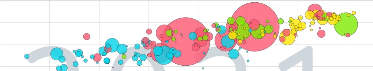
The presentation of the data is a mix of generated text and various types of graphs.

snip_datausa-graph3

snip_datausa-graph


The option above every graph allows to share, embed, download, get a table and even an API for the data.

snip_datausa-data3


And finally thematical maps provide other views and insights:
snip_datausa-map

Storytelling

But the fascinating part is Stories
snip_datausa-storiessnip_datausa-stories2

Various authors write stories focussing on special topics and using the presentation techniques of the site.

Background

A glossary explains technical terms and the About Section presents the authors and their aim:
‘In 2014, Deloitte, Datawheel, and Cesar Hidalgo, Professor at the MIT Media Lab and Director of MacroConnections, came together to embark on an ambitious journey — to understand and visualize the critical issues facing the United States in areas like jobs, skills and education across industry and geography. And, to use this knowledge to inform decision making among executives, policymakers and citizens.’

And this leads to the
Philosophy behind 

César A. Hidalgo, one of the websites’ authors explains why they did what they did in a blog post with the title ‘What’s Wrong with Open-Data Sites–and How We Can Fix Them.’

Here’s the design philosophy in a visual nutshell:

snip_datausa-design


‘Our hope is to make the data shopping experience joyful, instead of maddening, and by doing so increase the ease with which data journalists, analysts, teachers, and students, use public data. Moreover, we have made sure to make all visualizations embeddable, so people can use them to create their own stories, whether they run a personal blog or a major newspaper.’

And:

‘After all, the goal of open data should not be just to open files, but to stimulate our understanding of the systems that this data describes. To get there, however, we have to make sure we don’t forget that design is also part of what’s needed to tame the unwieldy bottoms of the deep web.’


API and Apps: An example fom official statistics

An example of an API access to statistical data

The U.S. Census Bureau  now offers some of its public data in machine-readable format. This is done via an Application Programming Interface (“API”).
Based on this API an App has been developed helping to query data from the Cenus 2010:

No data without legal clarification. The Census Bureau does it like follows:

‘Use
You may use the Census Bureau API to develop a service or service to search, display, analyze, retrieve, view and otherwise “get” information from Census Bureau data.
Attribution
All services, which utilize or access the API, should display the following notice prominently within the application: “This product uses the Census Bureau Data API but is not endorsed or certified by the Census Bureau.” You may use the Census Bureau name in order to identify the source of API content subject to these rules. You may not use the Census Bureau name, or the like to imply endorsement of any product, service, or entity, not-for-profit, commercial or otherwise.’

Open Government Data Benchmark: FR, UK, USA

Finally there’s a very interesting comparison of OGD in three leading countries.

qunb did it . Have a look at this presentation.

1) There are lots of duplicates on OGD platforms

.

2) There are very few structured data yet

.

.

3) Apps are the real challenge

There are different strategies fostering the developmemt of Apps made with open data. The U.K. method seems to be one of the most productive

.

The presentation in French

Official Statistics: Identify Common Challenges

In his Blog Director Groves of the US Census Bureau informs about an important discussion among his colleagues (thanks Xavier for this hint):

‘Several weeks ago, at the initiative of Brian Pink, the Australian statistician, leaders of the government statistical agencies from Australia, Canada, New Zealand, United Kingdom, and the United States held a summit meeting to identify common challenges and share information about current initiatives. ..

… They perceive the same likely future challenges for central government statistical agencies, and they are making similar organizational changes to prepare for the future. …

Ingredients of the future vision:

  1. The volume of data generated outside the government statistical systems is increasing much faster than the volume of data collected by the statistical systems; almost all of these data are digitized in electronic files.
  2. As this occurs, the leaders expect that relative cost, timeliness, and effectiveness of traditional survey and census approaches of the agencies may become less attractive.
  3. Blending together multiple available data sources (administrative and other records) with traditional surveys and censuses (using paper, internet, telephone, face-to-face interviewing) to create high quality, timely statistics that tell a coherent story of economic, social and environmental progress must become a major focus of central government statistical agencies.
  4. This requires efficient record linkage capabilities, the building of master universe frames that act as core infrastructure to the blending of data sources, and the use of modern statistical modeling to combine data sources with highest accuracy.
  5. Agencies will need to develop the analytical and communication capabilities to distill insights from more integrated views of the world and impart a stronger systems view across government and private sector information.
  6. There are growing demands from researchers and policy-related organizations to analyze the micro-data collected by the agencies, to extract more information from the data.

… In short, the five countries are actively inventing a future unlike the past, requiring new ways of thinking and calling for new skills.  The payoff sought is timelier, more trustworthy, and lower cost statistical information measuring new components of the society, economy, and environment, telling a richer story of our countries’ progress. ‘

Read the full blog post here: http://directorsblog.blogs.census.gov/2012/02/02/national-statistical-offices-independent-identical-simultaneous-actions-thousands-of-miles-apart/

Open data: Waiting ….

UK and US governments support open data … not only in their own countries. In an official letter they ask OECD to join this movement.

‘On behalf of US Secretary of State Hillary Rodham Clinton and UK Foreign Secretary William Hague, the heads of the two countries’ missions to the OECD delivered a letter this week to the Organisation’s Secretary General, Angel Gurría. In it, Mrs Clinton and Mr Hague called on the OECD to commit to the principles of the Open Government Partnership, and make all of its core data freely available online. ‘ https://usoecd.cms.getusinfo.com/data.html

and:

Awaiting an answer ……..

.

Recently

in Warsaw there was held the OGDcamp 2011.
Waiting for the keynotes posted …

#ogdcamp

.

An instructive introduction to Open data.

.

And …

a key message

from Vincenzo Patrunos presentation at ISTAT for the Italian Statistics Day (yes! October 20th !!) where were discussed about Open Data and Open Government  during the workshop “Open Official Statistical Data”.

The same from his presentation at IMAODBC 2011. Have a look at it.

Waiting for the paper …. -;)


Infovis vs. Statistical Graphs?

Two statements from a controversy on data visualisation: statisticians vs. visualisation specialists,  statistical graphics vs. Information visualization (a.k.a infovis).  A controversy? Not really!

The visualisation expert: ‘And yet, visualization is much, much more than what it appears to be at first glance. The real power of visualization goes beyond visual representation and basic perception. Real visualization means interaction, analysis, and a human in the loop who gains insight. Real visualization is a dynamic process, not a static image.  Real visualization does not puzzle, it informs.’

Robert Kosara, UNC Charlotte, http: // eagereyes. org/

The statistician: ‘ … differences between statistical graphics and infovis. In statistical graphics we aim for transparency, to display the data points (or derived quantities such as parameter estimates and standard errors) as directly as possible without decoration or embellishment. ‘In a modern computing environment, a display such as Nightingale’s [infovis] could link to a more direct graphical presentation …., which in turn could link to a spreadsheet with the data. The statistical graphic serves as an intermediate step, allowing readers to visualize the patterns in the data.’

Andrew Gelman, Dep. of Statistics and Department of Political Science Columbia University, New York Antony Unwin, Department of Mathematics University of Augsburg

Read the two articles published in the joint newsletter of the Statistical Computing & Statistical Graphics Sections of the American Statistical Association, Volume 22.

‘This volume features two articles both looking at the aspects of “graphical displays of quantitative data”. In the first paper “Visualization: It’s More than Pictures!” by Robert Kosara, Robert sheds a light from the point of view of an InfoVis person, i.e. someone who primarily learned how to design tools and techniques for data visualization. With the second article “Visualization, Graphics, and Statistics” by Andrew Gelman and Antony Unwin, we get a similar view, but now from someone whose primary training is in math and/or statistics.’

In the introduction Jürgen Symanzik gives an excellent  crash course in data visualization and its power:

‘It appears as if statistical graphics have helped to detect the unknown and unexpected — again! Most of us know the classical examples from the last 150 years where statistical graphics have helped to discover the previously unknown. This includes John Snow’s discovery that the 1854 cholera epidemic in London most likely was caused by a single water pump on Broad Street, a fact he observed after he had displayed the deaths arising from cholera on a map of London. A second, well–known example is Florence Nightingale’s polar area charts from 1857, the so–called Nightingale’s Rose (sometimes incorrectly called coxcombs), that demonstrated that the number of deaths from preventable diseases by far exceeded the number of deaths from wounds during the Crimean War. These figures convinced Queen Victoria to improve sanitary conditions in military hospitals. Many additional important scientific discoveries based on the proper visualization of statistical data could be mentioned, but the most important fact is: New discoveries based on the visualization of data can happen here and now!

This is a message we should carry to our collaborators, students, supervisors, etc.: Statistical graphics (or visual data mining, visual analytics, or any other name you like) typically do not provide a final answer. But, statistical graphics often help to detect the unexpected, formulate new hypotheses, or develop new models. Later on, additional experiments or ongoing data collection as well as more formal methods (and p–values if you really want) may be used to verify some of the original graphical findings.’

Jürgen Symanzik Utah State University

Nightingale’s Rose

http://en.wikipedia.org/wiki/File:Nightingale-mortality.jpg

Mapping America

A recent project of The New York Times allows to ‘browse local data from the Census Bureau‘s American Community Survey, based on samples from 2005 to 2009’. It’s a great visual and interactive application designed by By MATTHEW BLOCH, SHAN CARTER and ALAN McLEAN.

Several topics and maps are available

and provide insights down to cities and blocks


‘Because these figures are based on samples, they are subject to a margin of error, particularly in places with a low population, and are best regarded as estimates.’

US Census Budget: House Bill Would Gut Economic Monitoring, Endanger GDP And Other Stats

From

‘WASHINGTON — If you think Congress doesn’t understand the economy now, wait till you see what a key House panel wants to do to the people who help figure it out.
Lawmakers are taking on the budget for the Census Bureau, pushing cuts that could leave economists and businesses in the dark about key economic information even as they are trying to map a path through a treacherous, uncertain economy.
The House Appropriations Committee is set to put the final touches on a funding bill Wednesday that proposes to slash the government’s data collection arm by 25 percent — a cut that economists and statistics experts say could end up costing…’ more -> Census Budget: House Bill Would Gut Economic Monitoring, Endanger GDP And Other Stats.

Journalism in the Age of Data

Journalism in the Age of Data from Geoff McGhee on Vimeo.

Journalists are coping with the rising information flood by borrowing data visualization techniques from computer scientists, researchers and artists. Some newsrooms are already beginning to retool their staffs and systems to prepare for a future in which data becomes a medium. But how do we communicate with data, how can traditional narratives be fused with sophisticated, interactive information displays?

Watch the full version with annotations and links at datajournalism.stanford.edu.

Produced during a 2009-2010 John S. Knight Journalism Fellowship at Stanford University.

Historical Statistics

From New York Times, Monday, September 6, 2010

Paul Krugman - New York Times Blog

Some readers have asked where I get the numbers that go into posts like this. The answer is the Millennial Edition of Historical Statistics of the United States. It’s a spectacular source. The bad news is that it’s paywalled. But if you’re at a university, or have access some other way — I guess there’s a print edition too, which libraries might have — it’s great.

By the way, for more contemporary stuff I rely heavily on Eurostat and the IMF WEO database, both free, and the OECD, some free, some not.