Open, Useful, Reusable

In OECD’s brand new publication ‘Government at a Glance 2015’ we can find a new indicator: The OUR Index. It stands for ‘Open, Useful, Reusable Government Data’.

‘The new OECD OURdata Index reveals that many countries have made progress in making public data more available and accessible, but large variations remain, not least with respect to the quality of data provided. Governments need to make participation initiatives more accessible, targeted, relevant and appealing.’ (p.8)

Method

‘The data come from the 2014 OECD Survey on Open Government Data. Survey respondents were predominantly chief information officers in OECD countries and two candidate countries (Colombia and Latvia). Responses represent countries’ own assessments of current practices and procedures regarding open government data. Data refer only to central/federal governments and exclude open government data practices at the state/local levels.’ (p.150)

.

Based on G8 recommendations

‘The OECD OURdata Index measures government efforts to implement the G8 Open Data charter based on the availability, accessibility and government support to promote the reuse of data, focusing on the central OGD portal in each country'( p.33)

‘The G8 Open Data Charter defines a series of five principles: 1) open data by default; 2) quality and quantity data; 3) usable by all; 4) releasing data for improved governance and; 5) releasing data for innovation, as well as three collective actions to guide the implementation of those principles.’
‘As a first step in producing a comprehensive measure of the level of implementation of the G8 Open Data Charter, the OECD pilot Index on Open government data assesses governments’ efforts to implement open data in three dimensions:
1. Data availability on the national portal (based on principle 1 and collective action 2);
2. Data accessibility on the national portal (based on principle 3) and
3. Governments’ support to innovative re-use and stakeholder engagement (principle 5).
The only principle not covered in this year’s index is Principle 4: Releasing Data for improved governance value (e.g. transparency) as existing measurement efforts have focused primarily on socio economic value creation’ (p.150)

.

And here comes the ranking

2015-07-10-OURdataIndexData for this chart: http://dx.doi.org/10.1787/888933249180

Detailed data for the countries: http://dx.doi.org/10.1787/888933249175

The publication

The publication: OECD (2015), Government at a Glance 2015, OECD Publishing, Paris. http://dx.doi.org/10.1787/gov_glance-2015-en

2015-07-10-Govataglance2015

Methods changed – Information changed

The joint OECD – WTO Trade in Value-Added Initiative breaks with conventional measurements of  trade, which record gross flows of goods and services each time they cross borders. It seeks instead to analyse the value added by a country in the production of any good or service that is then exported, and offers a fuller picture of commercial relations between nations.

The new methodology and its results are visually explained. Video and an interactive presentation give beautifully made insights.

2013-01-20_valueaddedCH

Open data: Waiting ….

UK and US governments support open data … not only in their own countries. In an official letter they ask OECD to join this movement.

‘On behalf of US Secretary of State Hillary Rodham Clinton and UK Foreign Secretary William Hague, the heads of the two countries’ missions to the OECD delivered a letter this week to the Organisation’s Secretary General, Angel Gurría. In it, Mrs Clinton and Mr Hague called on the OECD to commit to the principles of the Open Government Partnership, and make all of its core data freely available online. ‘ https://usoecd.cms.getusinfo.com/data.html

and:

Awaiting an answer ……..

.

Recently

in Warsaw there was held the OGDcamp 2011.
Waiting for the keynotes posted …

#ogdcamp

.

An instructive introduction to Open data.

.

And …

a key message

from Vincenzo Patrunos presentation at ISTAT for the Italian Statistics Day (yes! October 20th !!) where were discussed about Open Data and Open Government  during the workshop “Open Official Statistical Data”.

The same from his presentation at IMAODBC 2011. Have a look at it.

Waiting for the paper …. -;)


OECD Regions at a Glance 2011 – Interactive edition

Education levels, employment opportunities and health resources across regions. How do they vary? Why do they matter?This interactive edition of OECD Regions at a Glance unlocks the wealth of information behind this book to help you better see, understand and explore the range of data and findings that shape our regions.You can navigate both the latest comparable data and past trends across regions in OECD countries and emerging economies on a range of economic, social, demographic and environmental topics via interactive maps and graphs, shareable data and country links.

OECD Regions at a Glance has been offering a statistical snapshot of how life is lived – and can be improved – from region to region in the OECD area since 2005.

To get started, click on the chapter titles above.

Better Life Index

Housingincomejobscommunity,educationenvironmentgovernancehealthlife satisfactionsafety,work-life balance – these are the indicators proposed in OECD’s Better Life Index .

In a interactive tool, Your Better Life Index, OECD enables participants to rate their country on the things they feel make for a better life.  ‘ The Index allows citizens to compare well-being across 34 countries, based on 11 dimensions the OECD has identified as essential, in the areas of material living conditions and quality of life’.

More about this initiative and esurvey on OECD’s website.

.

NComVA: Enable anyone to easily create and share interactive statistics news through our recognized Publishing tools

Statistics eXplorer help you discover patterns and insight to provide the basis for better understanding and decisions with the same tools and methodologies that today are used by our customers OECD, Eurostat, World Bank and many national and regional statistics bureaus. Passing on knowledge from your analysis and storytelling through our Publisher Statistics to your website or blog using a Flash based dynamic visualization. Statistics Explorer represents a unique and elegant layout where the visualization is in focus and user interfaces reside invisible in the background. An effective combination of time-linked views can simultaneously analyze and visualize data and help you make the right decision when you need to know more about national or regional statistics.
Customizable (Open) Statistics eXplorer is the generic version of Statistics eXplorer for customizing statistics visualization applications for any regions and their related indicators. Our standard products World eXplorer (nations), Europe eXplorer (NUTS2 and NUTS3) and Sweden eXplorer (counties and municipalities) integrate data from official databases (World Bank, Eurostat, Statistics Sweden, SKL, etc.) with your own indicators and let you, for example, compare your regions of interest with others.


Historical Statistics

From New York Times, Monday, September 6, 2010

Paul Krugman - New York Times Blog

Some readers have asked where I get the numbers that go into posts like this. The answer is the Millennial Edition of Historical Statistics of the United States. It’s a spectacular source. The bad news is that it’s paywalled. But if you’re at a university, or have access some other way — I guess there’s a print edition too, which libraries might have — it’s great.

By the way, for more contemporary stuff I rely heavily on Eurostat and the IMF WEO database, both free, and the OECD, some free, some not.

Statistics for a changing world: Google Public Data Explorer in Labs

3/08/2010 08:25:00 AM from The Official Google Blog

Last year, we released a public data search feature that enables people to quickly find useful statistics in search. More recently, we expanded this service to include information from the World Bank, such as population data for every region in the world. More and more public agencies, non-profits and other organizations are looking for ways to open up their data and expand global access to this kind of information. We want to help keep that momentum going, so today we’re sharing a snapshot of some of the most popular public data search topics on Google. We’re also launching the Google Public Data Explorer, an experimental visualization tool in Google Labs.

Popular public data topics on Google
We know people want to be able to find reliable data and statistics on a variety of subjects. But what kind of statistics are they looking for most? To help us better prioritize which data sets to include in our public data search feature, we’ve analyzed anonymous search logs to find patterns in the kinds of searches people are doing, similar to the patterns you can find onGoogle Trends and Insights for Search. Some public data providers have asked us to share what we’ve learned, so we decided to put together an approximate list of the 80 most popular data and statistics search topics.

You can read the complete list at this link (PDF), but here’s the top 20 to get you started:

1. School comparisons
2. Unemployment
3. Population
4. Sales tax
5. Salaries
6. Exchange rates
7. Crime statistics
8. Health statistics (health conditions)
9. Disaster statistics
10. Gross Domestic Product (GDP)
11. Last names
12. Poverty
13. Oil price
14. Minimum wage
15. Consumer price index, inflation
16. Mortality
17. Cost of living
18. Election results
19. First names
20. Accidents, traffic violations

You’ll notice some interesting entries in the list. For example, we were surprised by how many people search for data about popular first and last names. Perhaps people are trying to decide what to name a new baby boy or girl? As it turns out, people are interested in a wide range of statistical information.

To build the list, we looked at the aggregation of billions of queries people typed into Google search, using data from multiple sources, including Insights for Search, Google Trends and internal data tools — similar to what we do for our annual Zeitgeist. We combined search terms into groups, filtering out spam and repeats, to prepare a list reflecting the most popular public data topics. As a statistician, it’s important for me to note that the data only covers one week’s worth of searches in the U.S., so there could be seasonal and other confounding factors (perhaps there was an election that week). In addition, preparing a study like this requires a fair amount of manual grouping of similar queries into topics, which is fairly subjective and prone to human error. While imperfect, we still think the list is helpful to consider.

The Public Data Explorer
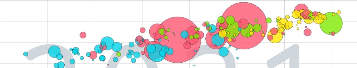
As you can see, people are interested in a wide variety of data and statistics, but this information is only useful if it’s easy to access, understand and communicate. That’s why today we’re also releasing the Google Public Data Explorer in Labs, a new experimental product designed to help people comprehend data and statistics through rich visualizations. With the Data Explorer, you can mash up data using line graphs, bar graphs, maps and bubble charts. The visualizations are dynamic, so you can watch them move over time, change topics, highlight different entries and change the scale. Once you have a chart ready, you can easily share it with friends or even embed it on your own website or blog. We’ve embedded the following chart using the new feature as an example:

This chart compares life expectancy and the number of births per woman over the last 47 years for most economies of the world. The bubble sizes show population, and colors represent different geographic regions. Press the play button to see the dramatic changes over time. Click “explore data” to dig deeper.

Animated charts can bring data to life. Click the play button in the chart to watch life expectancy increase while fertility rates fall around the world. The bubble colors make it quick and easy to see clusters of countries along these variables (e.g., in 1960 the European and Central Asian countries were in the lower right and Sub-Saharan Africa in the upper left). The bubble sizes help you follow the most populous countries, such as India and China. These charts are based on the Trendalyzer technology we acquired from the Gapminder Foundation, which we’ve previously made available in the Motion Chart in Google Spreadsheets and theVisualization API.

With a handful of data providers, there are already billions of possible charts to explore. We currently provide data from the same three providers currently available in our search feature: the World Bank, the U.S. Bureau of Labor Statistics and the U.S. Census Bureau. In addition, we’ve added five new data providers: the Organization for Economic Co-Operation and Development (OECD), the California Department of Education, Eurostat, the U.S. Center for Disease Control, and the U.S. Bureau of Economic Analysis. We’re excited that all around the world new data providers are deciding to make their information freely available on the Internet, enabling innovators to create interesting applications, mash up the data in new ways and discover profound meaning behind the numbers.

We hope our list and new tool help demonstrate both the public demand for more data and the potential for new applications to enlighten it. We want to hear from you, so please share your feedback in our discussion forum. If you’re a data provider interested in becoming a part of the Public Data Explorer, contact us.

Posted by Jürgen Schwärzler, Statistician, Public Data team