Hans Rosling’s concern has always been to help people understand the world with numbers, to take away their fear of numbers. And thanks to comprehensibly presented data, he wanted to convey insights that could lead to actions improving the world.
In this spirit, the –> Project Rosling led by the Swiss Confederation and its partners was created.
This project has now become the Unlocking the Power of Data Initiative.
Those responsible give the following reasons for the name change: ‘This current initiative was originally called “Project Rosling”. Due to some misunderstandings on who is behind the project, we renamed it in February 2023. The initiative was inspired by the work of the Roslings and the Gapminder Foundation.’
Hermann Burger, the so versatile Swiss writer once noted: “To be a writer means to have language beyond death”. For Hans Rosling (1948-2017), working hard to make statistics not only understandable but also respected and used, this is equally true. Once thanks to his bestseller ‘Factfulness‘ and now also thanks to a newly launched idea: “The Project Rosling”.
Project Rosling
Project Rosling has its origin in the UN World Data Forum in Bern (October 2021) and wants to continue the spririt of this event. The project website paraphrases this as follows: ‘The Project Rosling aims to bridge the gap between the data and statistical community and a diversity of stakeholders to advance data ecosystems and provide the information needed for a fact-based worldview’.
And in even more detail: ‘The Project Rosling follows the Road to Bern, an initiative of the Swiss Confederation that aimed to prepare discussions before the 3rd UN World Data Forum 2021 in Bern and to engage the public in the 2030 Agenda (more information here). Over one and a half years, conferences, debates and activities with the general public created a momentum within the data and statistical community that the Project Rosling will seek to maintain and expand. As such, it has two aims: > Expand the data and statistics dialogue > Deepen knowledge’ (-> go to source)
In memoriam
This meritorious project and its ambitious mission recall and continue what Hans Rosling pursued in his life and what was his interest and project. In an interview in 2013 he expressed himself as follows: ‘My interest is not data, it’s the world. And part of world development you can see in numbers’.
Over 11,000 students from 16 European countries signed up for the fourth edition of the European Statistics Competition (ESC). The ESC is a competition organized by Eurostat and volunteering National Statistical Institutes addressed to secondary education students with the purpose of encouraging students to get familiar with statistics and official statistical sources.
This year 61 teams participated in the European finals where they prepared a video on the topic »Information and disinformation: Official statistics in world overflowing with data«. Teams were very creative and demonstrated the importance of official statistical data in everyday life in various ways.
A jury of European experts selected the top five videos in both the age group 14–16 (category B) and the age group 16–18 (category A). The winners of each category will receive their prize at a virtual award ceremony that will take place on 16 June 2021.
The end for the traditional statistical yearbooks – be they printed or as ebooks – is approaching gradually.
The German yearbook has recently been hit. The last edition had its farewell at a press conference on 30 October 2019: “Digitisation is shaping the statistics of the 21st century. The expansion of our digital communication is necessary if we want to remain the leading provider of statistical information about Germany. We say goodbye to the Statistical Yearbook, which stood for our activities for almost seven decades. The yearbook goes, but the data remains. They are already available via our online services in greater abundance than ever before. …. One thing is clear: Rigid reference books are hardly in demand today. The trend is towards up-to-date, digitally available information. The information is researched online.” Source: Press conference destatis, 30 October 2019. Original in German.
Digi…. ?
The rationale for abolishing printed yearbooks is always the same: digit(al)ization continues, users have new needs and go online.
The three D’s.
What is meant by digit(al)isation?
‘Digitization essentially refers to taking analog information and encoding it into zeroes and ones so that computers can store, process, and transmit such information. … We refer to digitalization as the way in which many domains of social life are restructured around digital communication and media infrastructures.” Instead, … digital transformation … refers to the customer-driven strategic business transformation that requires cross-cutting organizational change as well as the implementation of digital technologies.
In the final analysis, therefore, we digitize information, we digitalize processes and roles that make up the operations of a business, and we digitally transform the business and its strategy. Each one is necessary but not sufficient for the next, and most importantly, digitization and digitalization are essentially about technology, but digital transformation is not. Digital transformation is about the customer.
There is no doubt that the Internet as a source of information is a priority, the first step does not go to the bookshelf, but digitally, to the smartphone, tablet or PC. Digitization has taken place, everything is available in binary form. And also digitalization in the form of digital types of information and communication: There are comprehensive websites of statistical institutions, some with more, some with less sensitive user guidance. And there are many interactive databases of these institutions, too. When users get to these sources, they await some work to find their way around, searching databases, before a table, a file or a simple website appears on the (often too small) screen.
Table-based yearbooks
After the end of the German Statistical Yearbook, there is a comprehensive alternative offer for the content: More tables, graphs and methodological explanations can be found on the web – with a little more effort, not concentrated. it’s like leaving a small, manageable town and having to find your way around a big city. And it is no longer a physically tangible object, guaranteed to be accessible over a long period and no longer – as a book can be – a visible showpiece and image carrier of the institution.
Statistisches Jahrbuch Deutschland 2019
Yearbooks with stories to tell
A specialty of traditional yearbooks is their texts. They offer a certain kind of storytelling. This is quite demanding because it is more than just boring retelling of table contents and it must not get involved in controversial or even politically colored explanations. Describing the context in the various thematic areas and pointing out remarkable developments make them stand out. They help to get a quick first orientation in the extensive data.
Here are a few examples of such storytelling yearbooks and how they – whether discontinued or not – have responded to the trend to digit(al)ization.
Canada till 2012
The Canadian Statistical Yearbook was an early standard for yearbooks that wanted to present a country and its international position in an attractive and widely understandable form. ‘Presented in almanac style, the 2012 Canada Year Bookcontains more than 500 pages of tables, charts and succinct analytical articles on every major area of Statistics Canada’s expertise. The Canada Year Book is the premier reference on the social and economic life of Canada and its citizens. This publication has been discontinued as of April 2013. The last issue of this publication was November 2012.The Canada Year Book 2006 to 2012 is available online in html and pdf formats.’
After some changes, it was closed in 2013. There is no digital alternative, unless – similar to the German solution – there is a thematically ordered overview of data, analyses, and references
Netherlands
The Dutch statistical yearbook was early converted from a printed to a PDF version. Abolished under the title Yearbook, but then continued as Trends in the Netherlands in 2014.
Yearbook 2014
The yearbook went, ‘Trends in the Netherlands’ came – even with more storytelling than before. To be found on the homepage.
Trends in the Netherlands 2019
Switzerland
The Swiss Statistical Yearbook is one of the last international editions still to be printed. And it is a comprehensive, multimedia, thematically organized reference work: infographics, extensive texts, tables, references in two languages and abstracts in two other languages make it widely accessible.
Digitalization has not passed this yearbook by either. Older editions can be consulted on the Office’s website and the text of the current yearbook is included as an introductory panorama in each of the thematic pages on the web.
Thematic homepage
The Panorama: An excerpt from the current printed yearbook, format pdf:
Panorama: Textual introduction
Eurostat
Most existing yearbooks entered the era of digit(al)ization entirely through file lists and interactive databases or through PDF versions. Eurostat has been going the other way for several years. The idea of a storytelling book functioning as a unit has been implemented digitally from the very beginning. And last but not least, with an educational intention that promotes statistical literacy. This edition is therefore also called Statistics Explained.
In each topic, this website finally leads to the all-embracing world of digital data and databases.
What else …. ?
Statistical yearbooks encounter digit(al)ization in very different ways: they disappear into (interactive) databases on the web, survive as PDF editions (more or less well integrated into websites) or celebrate a kind of resurrection in web-based book-like products. The strengths of yearbooks (especially those based on storytelling) are thus more or less lost: For example, a professionally curated, guaranteed reliable, easily usable and explained introduction to the essential data topics in one place and guaranteed to be available for many years to come. And an ever more extensive and better presented world of data on the Internet has emerged. An accessible wealth of information, of which one could hardly dream a few years ago.
But no matter how developed this data offer may be, it still lacks some simplicity and quick access to the right data. Anyone who has ever searched for data on different topics and over different periods knows how frustrating this can be. Which in the mass of partly similar files is the right one? How can various topics be combined in databases? How can the different time series be combined? Is it the right data for the question asked, can I use it without risk? Perhaps there are nuances in the method or definition of the data and they should not be compared with other data?
But often users don’t even come to the official sources, because the most common change in user behavior is googling. And the result may be a single figure or a large amount of links to very different sources
… digital transformation.
Statistical institutions are making great efforts in the field of digital innovation, as shown not least by the sometimes very attractive offerings. Many are working on so-called experimental statistics: Coding data faster and better with the help of artificial intelligence, creating and extracting indicators from big data and much more. All this should make the production of statistical data more efficient, less dependent on human intervention (and human error) and faster. In the field of data dissemination, such experiments are still lacking, at least to this day.
Are all these innovations the often mentioned digital transformation? At best, they are elements of it.
What digital transformation can users dream of? Perhaps that statistical information is produced in a rapid and uninterrupted process (like in a pipeline) and is provided with semantic information in such a way that a simple search over topics and periods delivers an unambiguous result and refers to important context information. That even in a digital transformation human intervention will still be necessary (at the latest in presentation, explanation, and support), is not a paradox: Perhaps the overall package of digital transformation also includes non-digital elements, dedicated print products that skilfully lead into the digital world.
In large amounts of data, information is hidden that can hardly be recognized with simple means. Special methods for data analysis are in demand and visualization techniques in particular help to overview the information gained and to pass it on in an understandable way.
Media have recognised the potential of statistical and other data years ago; this has led to what has been practised as data journalism in various large newspapers and also in newspaper co-operations.
The Datablog
A pioneer is The Guardian, whose datablog celebrated its 10th anniversary in March 2019:
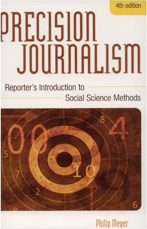
But hardly anyone is ever the first. Especially when it comes to the visualization of data, there are examples that date back centuries. But a new era has dawned with the use of computers in data analysis to generate interesting journalistic stories. Of central importance here is the person of Philip Meyer, who began to use computer-assisted reporting as a journalist in the 1960s.
In his book ‘Precision Journalism: A Reporter’s Introduction to Social Science Methods‘, published in his first edition in 1973, Meyer describes the demands on journalism that are still valid today and that are becoming data journalism.
‘There was a time when all you [as a journalist] needed was dedication to truth, plenty of energy, and some talent for writing. You still need those things, but they are no longer sufficient. The world has become so complicated, the growth of available information so explosive, that the journalist needs to be a filter, as well as a transmitter; an organizer and interpreter, as well as one who gath ers and delivers facts. In addition to knowing how to get information into print, online, or on the air, he or she also must know how to get it into the receiver’s head. In short, a journalist has to be a database manager, a data processor, and a data analyst. ….. In the information society, the needs are more complex. Read any of the popular journals of media criticism and you will find the same complaints about modern journalism. It misses important stories, is too dependent on press releases, is easily manipulated by politicians and special interests, and does not communicate what it does know in an effective manner. All of these complaints are justified. Their Cause is not so much a lack of energy, talent, or dedication to truth, as the critics some times imply, but a simple lag in the application of information science—a body of knowledge—to the daunting problems of reporting the news in a time of information overload. …. Today’s journalist must also be familiar with the growingjournalistic body of knowledge, which, therefore, must include these elements: 1 How to find information. 2 How to evaluate and analyze it 3 How to communicate it in a way that will pierce the babble of infor- mation overload and reach the people who need and want it. 4 How to determine, and then obtain, the amount of precision needed for a particular story. ‘
(Meyer, p. 1-2)
‘Data is not just about numbers’
Today’s data journalism is closely linked to the philosophy of open data. Data should be available in easily usable formats and be evaluable for everyone. But the claim of current data journalism – as represented by the Guardian authors – still follows the essential ideas of Philip Meyer.
‘We keep some of Meyer’s approach alive in how we do data journalism and we work alongside reporters to get the most out of the combination of data and specialist knowledge. Data is not just about numbers, and behind every row in a database there is a human story. They’re the stories we’re striving to tell. ‘ The Guardian Sat 23 Mar 2019
Examples
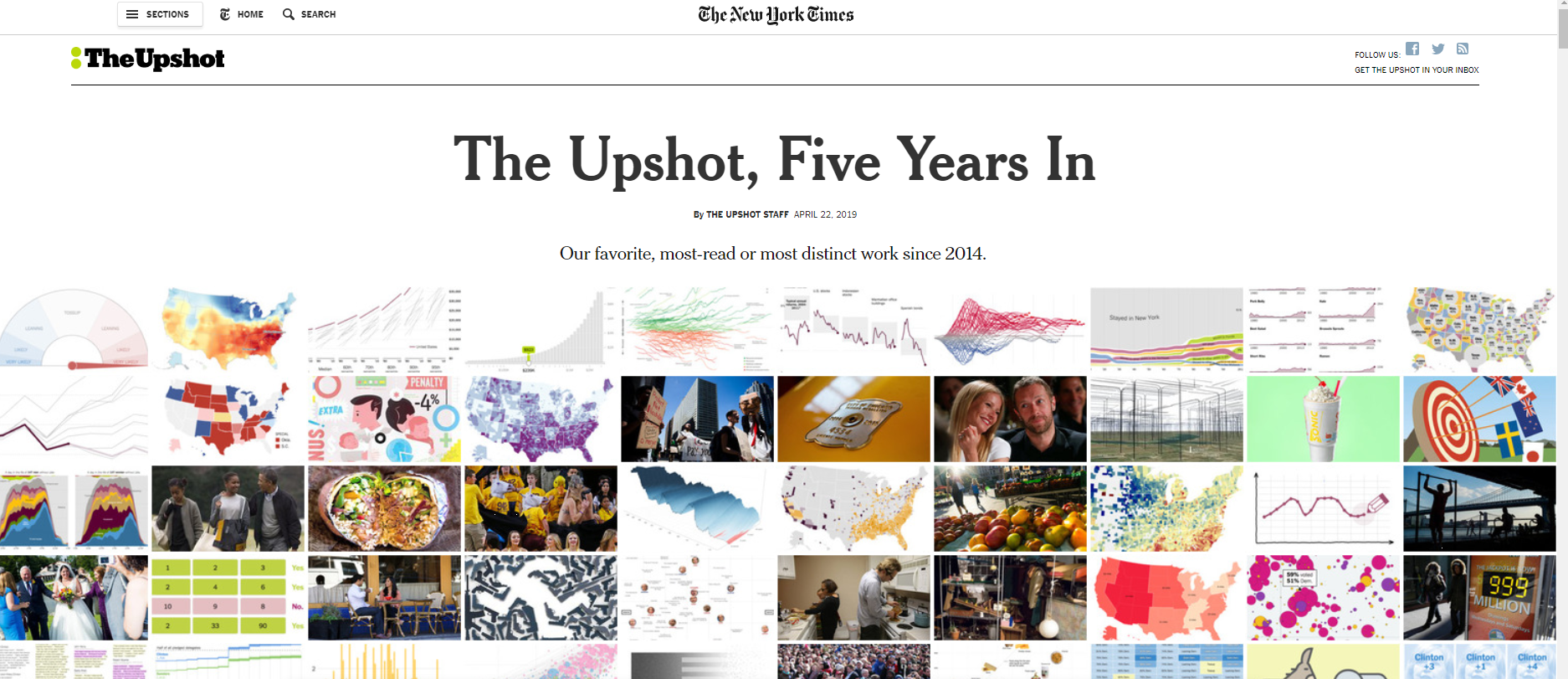
Since then, data-based journalism has set a trend. Many others publish data using graphics and are always looking for new ways to communicate the analysed data in an understandable way. One of many examples is the New York Times, which celebrates Upshot’s 5th anniversary in 2019:
‘Five years ago today, The New York Times introduced The Upshot with the aim of examining politics, policy and everyday life in new ways. We wanted to experiment with formats, using whatever mix of text, data visualizations, images and interactive features seemed best for the subject at hand.
In the meantime there are networks that share their knowledge and offer help for data journalism or Data Driven Journalism DDJ. One of them (mostly in German) is datenjournalismus.net
Outstanding
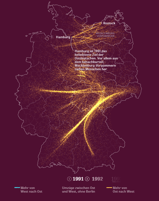
Among the thousands of data-based stories and their visualizations there are highlights again and again. I don’t want to withhold my recent favourite. It is the analysis and visualization of the internal migration after the German reunification. Die Zeit presented this with a lot of effort and fascinating results in May 2019.
He was a pioneer and a great inspiration for what public statistics always strives for: more visibility, more understanding and more resonance. Two years ago Hans Rosling (27 July 1948 – 7 February 2017) died too young.
Demanding and enriching was an encounter with Hans Rosling. His demand for public statistics was urgent and a prerequisite for his enlightening work: that statistical data should be open to all. Here he saw successes. It was and is enriching how he conveyed these data combined with a message. With innovative, precise, entertaining and always very personal presentations, he clarified what had happened and what developments could be desired. He was a realist regarding his effectiveness and yet always an optimist ….. better: a “possibilist”. What remains for me is how he taught to see with numbers – a constant challenge for public statistics.
Gapminder (“a fact tank, not a think tank”), with its innovative tools and commitment, continues to live with Anna Rosling Rönnlund and Ola Rosling.
And recently Factfulness, a book by the three (Hans Rosling, Anna Rosling Rönnlund, Ola Rosling) has been published with the subtitle “Ten Reasons We’re Wrong About The World – And Why Things Are Better Than You Think”
“Factfulness: The stress-reducing habit of only carrying opinions for which you have strong supporting facts. “
My colleagues published the Slovene multi-player statistical quiz app on Tuesday 22nd. I love it!
We’ve all heard “statistics is boring”, but once you add lovely design, humorous content and a strategic game to it, it can be fun. In two days after the announcement there are more than 1200 players who already played abt. 24.000 games. And we know a lot more about Slovenia than we knew three days ago 😉
How the game works: First one selects his player name, then a favourite character (a hero from Slovenia), turns the wheel of fortune (automatic selection of the region one plays for) and then looks for an opponent (a region or a player). Each game has 7 questions, the last one always being a number range slider (statistical data). The one who wins gets some resources and so each region gradually evolves from the prehistory to the future. The competiton of the 12 regions lasts for 7 days, then the game resets to the starting point (keeping the overall score board of players).
In the current version we have about 2000 questions, 500 of these are statistical (others include interesting info about local peculiarities, history, literature, language, geography …).
At the moment there is the Slovene version only, but the App is ready to be translated or adjusted for another country (if adjusting you’d have to invest also into some graphic design adjustments). I sincerely hope we’d make an English version of the Slovene game someday, for our foreign visitors or fans of Slovenia 😉
No day without numbers in (social) media, in everyday life. And they not only want to inform us, they also want to orient us in one direction or the other.
And every day are among them deliberately or unintentionally false or misleading numbers.
Therefore, statistics must arm themselves against incorrect use of data and repeatedly teach the correct handling of statistical data.
There have long been numerous works on this subject. Here is another quite basic presentation by the Dutch journalist Sanne Blauw.
She picks out five statistical sins.
The fact that such presentations often use numbers themselves, which would also have to be viewed critically, does not diminish the value of her warnings.
In a recently published EUROSTAT publication, the authors demand innovative forms of communication from public statistics in order not to lose their socially important role. Among other things, they demand ‘…. to tell stories close to the people; to create communities around specific themes; to develop among citizens the ability to read the data and understand what is behind the statistical process.’
Telling Stories
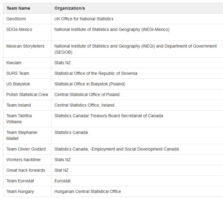
The UNECE hackathon that has just been completed responds to this challenge.
‘A hackathon is an intensive problem-solving event. In this case, the focus is on statistical content and effective communication. The teams will be challenged to “Create a user-oriented product that tells a story about the younger population”. During the Hackathon, fifteen teams from nine countries had 64.5 hours to create a product that tells a story about the younger population. The teams were multidisciplinary – with members from statistical offices and other government departments. The product created should be innovative, engaging, and targeted towards the general public (that is, not specialists). There was no limit on the form of the product, but the teams had to include a mandatory SDG indicator in the product. The mandatory indicator was “Proportion of youth (aged 15-24 years) not in education, employment or training” SDG indicator (Indicator 8.6.1).‘ (Source)
Winners
And the hackathon shows impressive results, even if only a few organisations have participated.
…is aesthetically pleasing and easy to use. The interaction is left to the user and can be individually controlled by him/her in the speed.
The diagrams do not stand alone, but are explained by short texts while scrolling.
The results are not just being accepted. Rather, the concepts are explained and questioned – statistics are presented with the methodological background.
…starts with a jourmalistic approach. Here too, the interactivity can be controlled by the user at the desired speed.
At the end, the authors also seek direct contact with the users; a quiz personalizes the statistical data and gives an individual assessment of where the users stand personally with regard to these statistics.
Success Factors
The two applications mentioned above combine decisive user-friendly features:
– visually attractive,
– easy-to-understand navigation that can be controlled by the user according to his needs,
– the journalistic approach,
– concise and instructive explanations,
– personalization,
– hints on the methodological background.
Many of the other applications show the frequently encountered weaknesses: Too much information should be provided, no courage to leave something behind and concentrate on the most important elements. And this leads to long texts and complex navigation with the effect that users quit quickly.
In a recent paper Emanuele Baldacci, (Director, Eurostat) and Felicia Pelagalli, (President, InnovaFiducia) deal with the ‘challenges for official statistics of changes in the information market spurred by network technology, data revolution and changes in information consumers’ behaviours’ (p.3)
Three scenarios
The status-quo or bad scenario:
‘Information will continue to be consumed via multiple decentralized channels, with new information intermediaries emerging through social platforms, digital opinion leaders, technologies that reinforce belonging to peers with similar profiles and backgrounds, including in terms of beliefs.’ … ‘Under this scenario it is likely that increased competition from alternative data providers will put pressure on the official statistics position in the information ecosystem and lead to drastic reduction of public resources invested in official statistics, as a result of the perceived lack of relevance.’ (p.8)
The ugly scenario:
‘Big oligopoly giants will emerge by integrating technologies, data and content and providing these to a variety of smaller scale platforms and information intermediaries, with limited pricing power for further dissemination. In this scenario, data generated by sensors and machines connected to the network will increasingly create smart information for individuals. However, individuals will not participate in the data processing task, but will be mostly confined to crowdsourcing data for digital platforms and using information services.’
‘In this scenario, official statistics will be further marginalized and its very existence could be put in jeopardy. More importantly, no public authority with significant influence could be in charge of assessing the quality of data used in the information markets. Statistics as a public good may be curtailed and limited to a narrow set of dimensions. … Official statisticians will appear as old dinosaurs on the way to extinction, separated from the data ecosystem by a huge technology and capability gap.’ (p.9)
The good scenario:
The authors do not stop here. They also see a good scenario, but a scenario that implies a huge engagement.
This scenario is ‘predicated on two major assumptions. First, the information market will be increasingly competitive by sound regulations that prevent the emergence of dominant positions in countries and even more important across them. Second, official statistics pursue a strong modernization to evolve towards the production of smart statistics, which fully leverage technology and new data sources while maintaining and enhancing the quality of the data provided to the public.
In this scenario, official statistics will generate new more sophisticated data analytics that cater to different users by tailored information services. It uses network technologies (e.g., blockchain, networks) to involve individuals, companies and institutions in the design, collection, processing and dissemination of statistics. It engages users with open collaborative tools and invests heavily in data literacy to ensure their usability. It strengthens skills and capacity on statistical communication to help users understand in transparent manners what are the strengths and limitations of official statistics.’ (p. 9/10)
Actions needed to face the challenges ahead
The good scenario already depicts some needed actions to be taken by official statisticians. The authors conclude with proposals that are not really new, ideas that have been on the table for some time but are not so easy to implement.
‘It is important to change mindsets and practices which have been established, in order to put in contact the citizens with official statistics, to make data accessible, to expand the understanding of their analysis, to support individuals, business and institutions in the decision-making process.
The key issue is how to be authoritative and to develop quality knowledge in the new and changing information market. It is important to know the rules and languages of the media platforms used for communication; to overcome the technicalities; to tell stories close to the people; to create communities around specific themes; to develop among citizens the ability to read the data and
understand what is behind the statistical process. In summary, put people at the center (overused phrase, but extremely valuable):
⎯ communicate statistics through engaging experiences and relevant to the people who benefit from them;
⎯ customize the content;
⎯ adopt “user analytics” to acquire the knowledge of the “users” through the analysis of data (web and social analytics) and the understanding of people’s interaction with the different platforms.’ (p.11)
And the concluding words call for external assistance:
‘It will be essential for statisticians to build more tailored data insight services and team up with communication experts to play a more proactive role in contrasting fake news, checking facts appropriately and building users’ capacity to harness the power of data.’ (p.12)
Eurostat’s biennial scientific conference on New Techniques and Technologies for Statistics (NTTS) is over, a labyrinth of a website is online and tons of documents are somewhere published.
CBS Corporate nieuws summarizes the important trends discussed:
1) New data sources and the consequences
2) The importance of a proactive communication
3) Big Data and algorithms in official statistics
CBS, 06-06-2017 Miriam van der Sangen
Corporate websites
Why taking this information just from CBS (the Dutch Statistical Office)? Because CBS Corporate nieuws is an excellent example of the second trend: proactive communication, proactivity in delivering (statistical) information to users. The website makes corporate information public and gives insights into activities of CBS and statistics. You see topics …
… and the people behind it.
The target public of this corporate website are enterprises, administrations, journalists, students and whoever may be interested.
Corporate websites like CBS’ are not quite usual. They are resource consuming but are probably very good in helping to understand statisticians’ mission and work .. and in motivating employees.