… and how do statistical institutions present what they do?
In times of fake news and austerity measures, statistical offices are feeling more and more the urge to orientate the public about themselves and the usefulness and necessity of trustworthy statistics.
But how to proceed?
Public relations specialists know countless ways to get messages to the target groups. A traditional and usually quite boring way are annual reports. They’re usually just an obligatory thing and treated accordingly.
Annual reports as ambassadors for public statistics
Is this still a quite boring lecture under the changing circumstances mentioned above? Let’s look at a few examples.
#1 European Official Statistics
The European Statistical Governance Advisory Board publishes the report, which focuses on fake news and trust issues. It’s mainly a control report with recommendations to be re-evaluated next year.
Not everyone’s reading but with some interesting facts about the European statistical infrastructure.
‘ … this year’s Report focuses on the importance of good governance to maintain and increase trust in official statistics, ensuring appropriate access to administrative and privately-held data, and the practical challenges of coordinating NSSs.
Chapter 1 looks first at the challenge of maintaining and enhancing trust in official statistics when there is conflicting information provided by non-official sources or when statistical indicators fail to relate to citizens’ actual experiences. Access to administrative records and privately-held data is then examined, highlighting some of the difficulties encountered by NSIs and the need to ensure that the transposition of the new Regulation on General Data Protection into national law does not hinder access to data for statistical purposes. Finally, the challenge of coordination within NSSs is discussed, particularly in relation to ONAs.
Chapter 2 provides ESGAB’s overview of the implementation of the Code of Practice, ..
Chapter 3 reviews ESGAB’s activities over its first nine years, … ‘ (p.10)
‘

Glossary
European Statistics
Code of Practice (‘the Code’)
The European Statistics Code of Practice sets
the standards for developing, producing and
disseminating European statistics. It builds on
a common definition of quality in statistics used
in the European Statistical System, composed of
national statistical authorities and Eurostat. ….
European Statistical Governance
Advisory Board (ESGAB, ‘the Board’)
ESGAB provides an independent overview of
the implementation of the Code of Practice. It
seeks to enhance the professional independence,
integrity and accountability of the European
Statistical System, key elements of the Code,
and the quality of European statistics …..
European Statistical System (ESS)
The European Statistical System is a
partnership between the European Union’s
statistical authority, i.e. the Commission
(Eurostat), the National Statistical Institutes
(NSIs) and Other National Authorities (ONAs) ….
Some interesting facts given in this report:
.
#2 UK
UK is of a similar type to the EU. Somewhat more systematic, with clear performance targets and evaluated indicators …. and tons of financial data.

‘This year has been a challenging one for those of us working in official statistics. Numbers were very much in the news in the run-up to the EU referendum and since. Examples of bad use of numbers and misrepresentation of statistics can cast a shadow over the validity and integrity of evidence. However, information that can be accepted and used with confidence is essential to good decision making by governments, businesses and individuals.’ …’ (John Pullinger,p.4)
‘The 2007 Act requires that the Authority produces a report annually to Parliament and the devolved legislatures on what it has done during the year, what it has found during the year and what it intends to do during the next financial year. This report fulfills that responsibility.’ (p.9)
‘STRATEGIC OBJECTIVES
To achieve its mission, over five years the Authority will focus on five perspectives:
a helpful, professional, innovative, efficient and capable statistical service will, we believe, serve the public good and help our nation make better decisions.’ (p.9)
.
‘KEY PERFORMANCE INDICATORS
The Authority’s Business Plan includes a number of Performance Metrics through which we monitor performance. Our performance against these indicators is summarised in the table below. It is important to note our targets are always used to stretch performance ..’ (p. 9)
And some interesting facts:
#3 Sweden
Sweden reports concisely on a few central goals and with the obligatory information on the organisation and infrastructure.

‘Statistics Sweden plays a key role in public infrastructure. Its task is to develop, produce and disseminate official and other government statistics. The Official Statistics Act sets out a number of criteria concerning statistical quality, in which statistical relevance is a top priority.’ (Joakim Stymne, p. 4)

‘Punctuality in publishing remained high and amounted to 99 percent. No corrections that were considered serious were made to the published statistics during the year, and there were fewer internal error reports than in 2016.’ (p. 7)


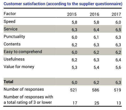
‘During 2017, Statistics Sweden has studied how its customers and users view the agency and its products in different ways.’ (p. 10)
–
#4 Switzerland
Switzerland differs from other reports in two ways:
– The report shows not only the activities of the Office, but also the state of the country according to various topics (the milestones of the multi-annual statistical programme, and at the same time a small Statistical Yearbook).
– And it is very personal, responsible persons behind the statistics become visible.
 German and French only
‘Die erste Halbzeit der Legislatur ist um und damit auch die ersten zwei Jahre des statistischen Mehrjahresprogramms 2016–2019. Die darin festgelegten Ziele und Schwerpunkte bilden die Leitlinien für die Arbeit der Bundesstatistik. Die für das Jahr 2017 geplanten Meilensteine konnten erfolgreich umgesetzt werden. … … der Auftrag der Bundesstatistik wie folgt zusammengefasst: «Im Zentrum des Auftrags der Bundesstatistik stehen die Erstellung und die Vermittlung von nutzergerechten Informationen zu wichtigen Lebensbereichen unserer Gesellschaft. Diese Informationen dienen unter anderem der Planung und Steuerung zentraler Politikbereiche, deren Stand und Entwicklung mit Hilfe der statistischen Informationen beobachtet und beurteilt werden können.” (Georges-Simon Ulrich, p.5)
The state of statistics in the topic areas: e.g. Population

And the targets for the future: focal points and priority developments in the coming year:
Some interesting facts about structure and publishing
Staff
Publishing
.
# 5 Germany
Germany is taking a quite different approach: the annual report is more like a scientific magazine. With interviews and contributions to focal topics.

‘ People are being guided more by their emotions and less and less by facts – this is how we might sum up the post-truth debate which reached its hitherto climax last year, culminating in “postfaktisch” (post-factual, or post-truth) being chosen as the German Word of the Year 2016. …
I hope that all of the other topics dealt with in this report provide you with a good insight into all matters figure-related and that, in so doing, we can enhance your trust and confidence in official statistics.’ (Dieter Sarreither, p.3).
.
The table of contents shows how this report is designed as a magazine
.
Some interesting information about the office
.
This report also gives itself a personal touch and shows the responsible management personnel
.
# Conclusion
Annual reports are certainly not the most effective way of informing the public about the activities and importance of statistical institutions. They must be approached with other measures; they must be embedded in PR measures. Then they can – especially if they are well made – contribute a lot to understanding official statistics.